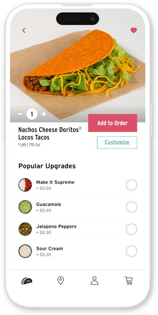
App screen showing a the nachos cheese doritos taco.
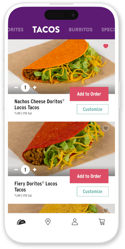
App screen listing the types of tacos offered by taco bell.
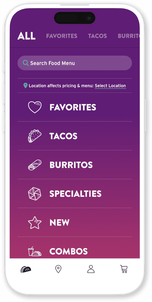
App screen showing the Taco Bell menu categories

Taco Bell App

Taco Bell App

Restoring Brand Reputation & User Satisfaction

The Problem

Taco Bell's previous app was outdated, offered limited customization, had a cumbersome checkout, and lacked personalization, resulting in poor user satisfaction, low ratings, and disappointed fans.

Agency / Client

Razorfish / Taco Bell

Project Type

Product Design

App Design

Branding

Project Type

Product Design

App Design

Branding

My Role

Design Lead

My Role

Design Lead

Industry

Restaurant

Industry

Restaurant

Pattern leveraging icons and shapes and filled with a purple gradient.
Key Objectives

• Update brand aesthetic

• Prioritize customization

• Quick and easy checkout process

• Implement learned logic to offer a more personalized experience

My Role

Led the project from start to finish, implementing advanced logic, enhancing customization, streamlining checkout, and updating aesthetics. Coordinated with teams, managed client communications, worked with overseas developers, and ensured design integrity through visual QA.

Challenges

Solving for a litany of edge cases inherent to increased functionality and greater user control.

Adhering to a highly aggressive and demanding timeline.

Facilitating client review discussions, justifying our decisions, and deliberating new insights.

1

Research

Competitive Analysis

Focus Groups

Strategy Planning

2

Design

Wire Frames

Visual Design

Review / Revise / Approve

1

Research

Competitive Analysis

Focus Groups

Strategy Planning

2

Design

Wire Frames

Visual Design

Review / Revise / Approve

3

Analyze

Prototype

User Testing

Refinement

4

Launch

Track Usage Patterns

Identify Logic Opportunities

Implement New Features

3

Analyze

Prototype

User Testing

Refinement

4

Launch

Track Usage Patterns

Identify Logic Opportunities

Implement New Features

1

Research

Competitive Analysis

Focus Groups

Strategy Planning

2

Design

Wire Frames

Visual Design

Review / Revise / Approve

3

Analyze

Prototype

User Testing

Refinement

4

Launch

Track Usage Patterns

Identify Logic Opportunities

Implement New Features

Learned Logic

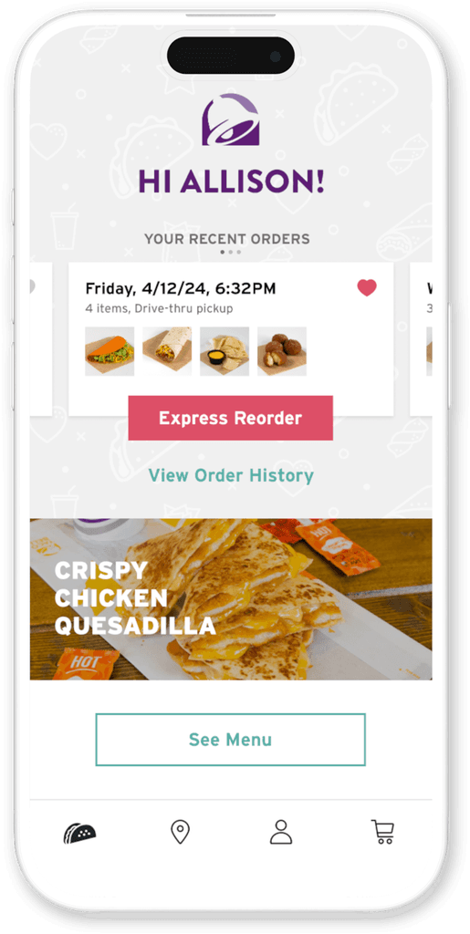
Data showed that users typically stick to consistent orders, so we implemented easy reordering from the home screen.

App screen showing express reorder access from the home screen.
Customize

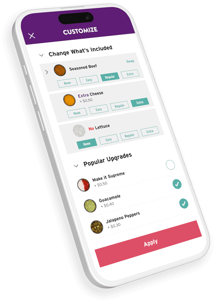
Making customization easy to access and intuitive to use was a priority to personalize and enhance the brand experience.

App screen showing express reorder access from the home screen.
App screen showing available customizations.
Checkout
Checkout

A smooth and easy checkout process that gives user control over location, pickup details and payment methods.

A smooth and easy checkout process that gives user control over location, pickup details and payment methods.

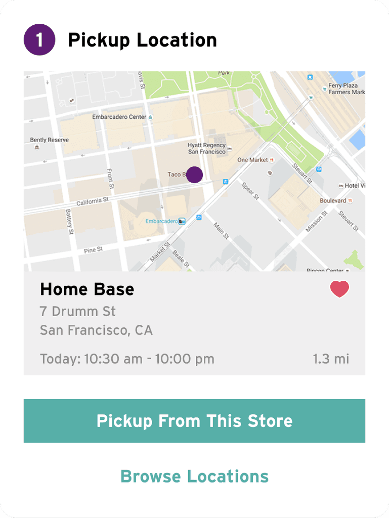
Showing step 1, location selector for the checkout process.

Step 1: Pickup Location

Automatically default to your favorite store or the nearest location. With location permissions enabled, our system tracks your proximity to stores and provides tailored recommendations.

Step 1: Pickup Location

Automatically default to your favorite store or the nearest location. With location permissions enabled, our system tracks your proximity to stores and provides tailored recommendations.

Step 2: Pickup Details

Users can decide whether to pick up their food now or schedule it for later, with the option to specify in store or drive-thru pickup.

Step 2: Pickup Details

Users can decide whether to pick up their food now or schedule it for later, with the option to specify in store or drive-thru pickup.

Step 3: Payment Method
In the final step, users choose their preferred payment method, and an order confirmation is sent via email.

Step 3: Payment Method
In the final step, users choose their preferred payment method, and an order confirmation is sent via email.

Outcomes

The client prioritized improving their app store standing as feedback indicating brand perception. After launching our updated app, Taco Bell's iOS rating rose from 3.5 to 4.7 with over 1.1M reviews and now ranks #6 in the food and drink category.

While updates have been made since the intial launch, the core logic and functionality crafted by our team remains intact.

My Key Learnings

This experience proved to be a master class in product, UI & app design as I collaborated with a range of team members on both agency and client sides.

A behind the scenes look into how a major brand operates allowed me to hone my communication skills and improve my presentation skills.

The importance of testing as users can quickly dispel even the most assumed of strategies.

The journey continues,
check out what's next!

© 2024 Brian M. Peters

© 2024 Brian M. Peters

© 2024 Brian M. Peters