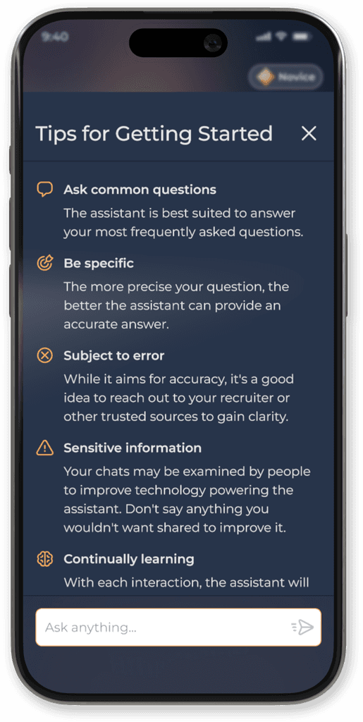
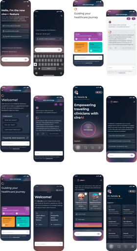
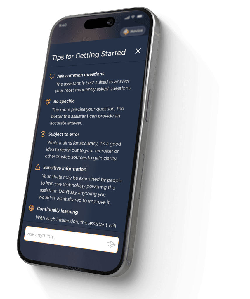
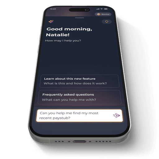
App screen highlighting best practices for how to chat with our conversational AI
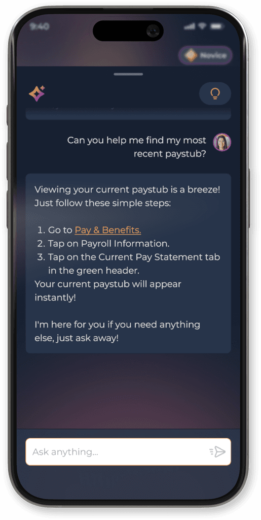
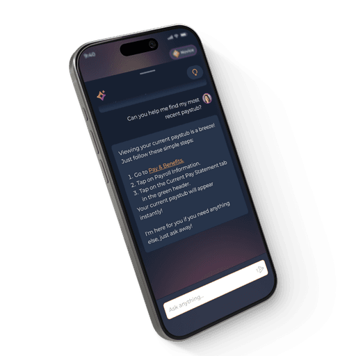
App screen showing conversation styling for an AI chat interface
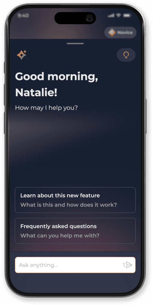
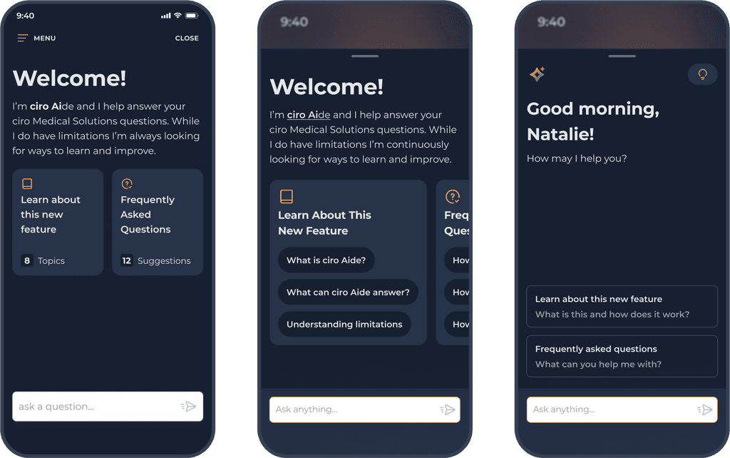
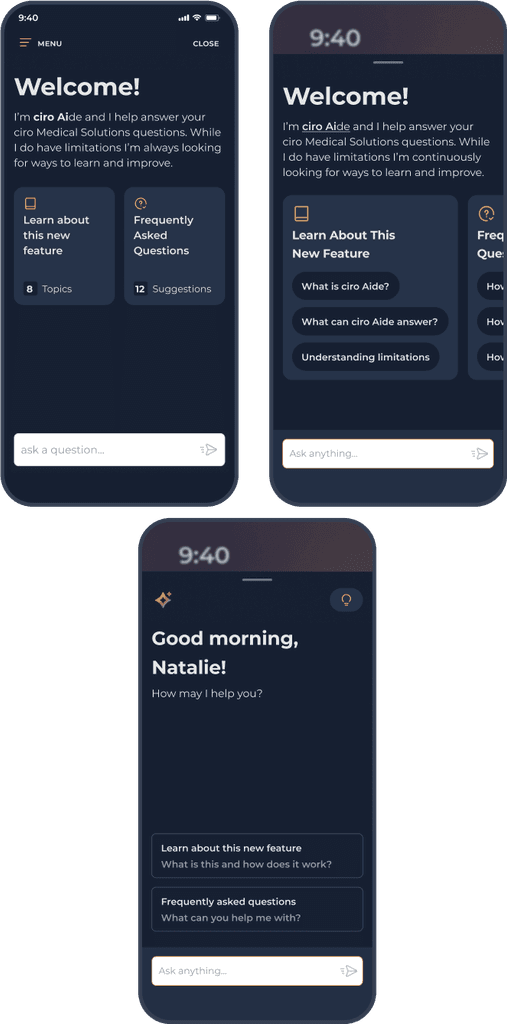
App welcome screen for an AI chat interface

ciro AI

Giving Time Back to Healthcare Recruiters & Clinicians

The Problem

Our recruiters spend hours each week answering common clinician questions about our services within ciro, our platform where clinicians search for and secure traveling assignments. This time adds up, hindering recruiters from taking on more and limiting clinicians' access to helpful information without recruiter availability.

Company

Medical Solutions

Project Type

AI Design

Feature Design

Branding

Project Type

AI Design

Feature Design

Branding

My Role

Design Lead

My Role

Design Lead

Industry

Healthcare

Industry

Healthcare

Icon design exploration
Final visual approach for our AI icon
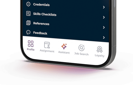
App screen highlighting an AI chat icon
Key Objectives

• Prioritize AI assistance surrounding FAQs

• Incorporate AI within existing product space

• Reduce recruiter and clinician back and forth

• Ensure AI platform can grow and evolve with future initiatives

My Role

I led cross-functional collaboration between design, product, and engineering teams to ensure seamless alignment on user needs and technical constraints, while driving scalable design solutions.

Challenges

Venturing into AI implementation despite limited prior knowledge.

Determining what UX patterns to leverage amid the novelty of this new technology.

Creating an intuitive user experience to ensure our AI solution is embraced over traditional recruiter assistance.

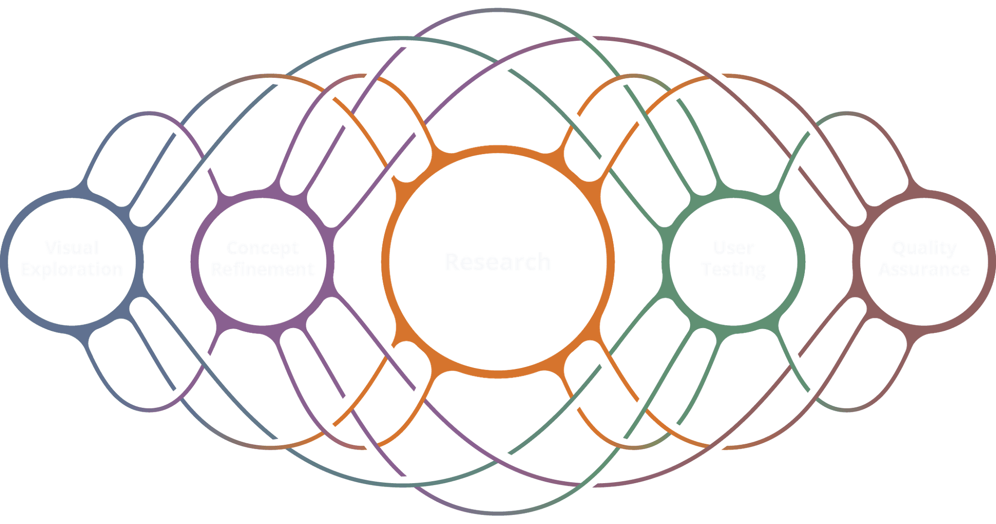
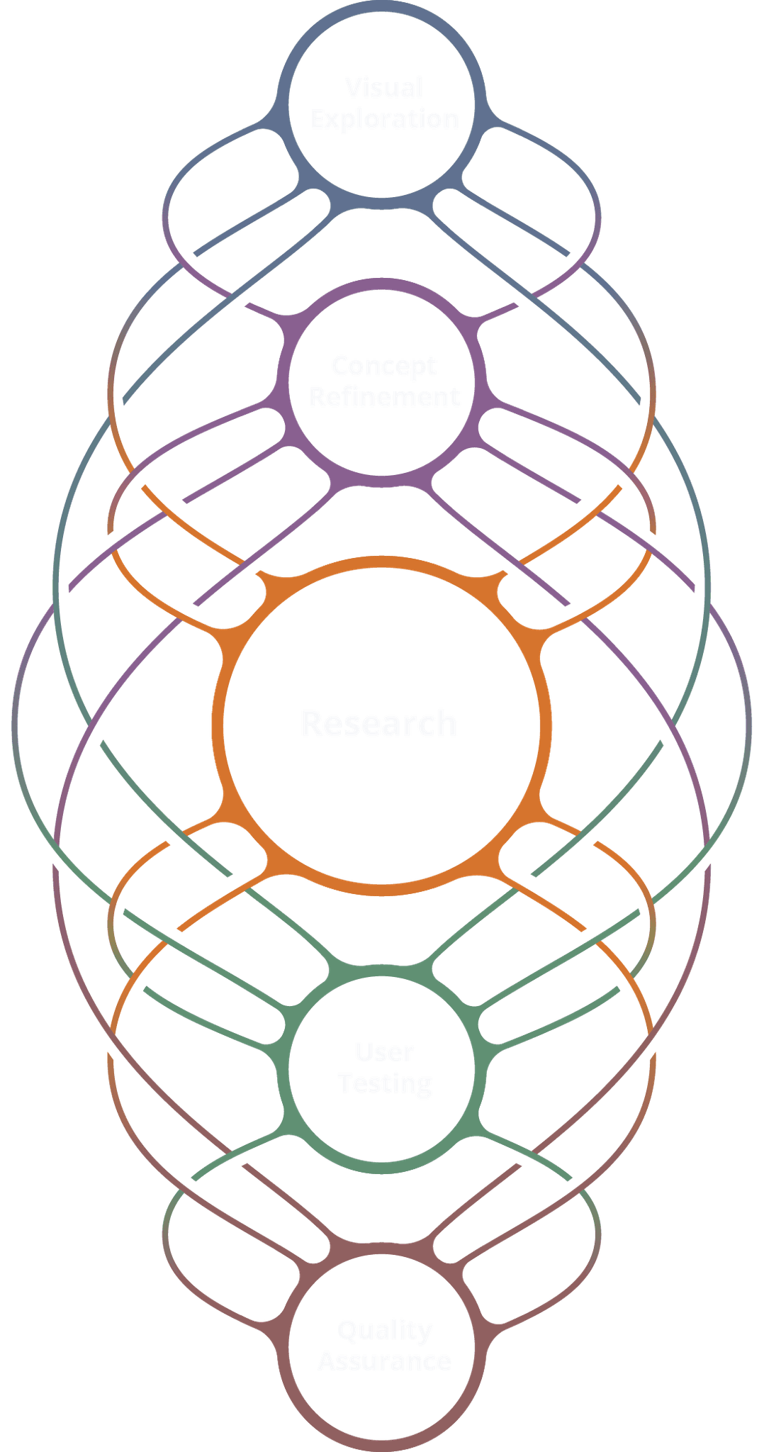
Graphic showing fluid process

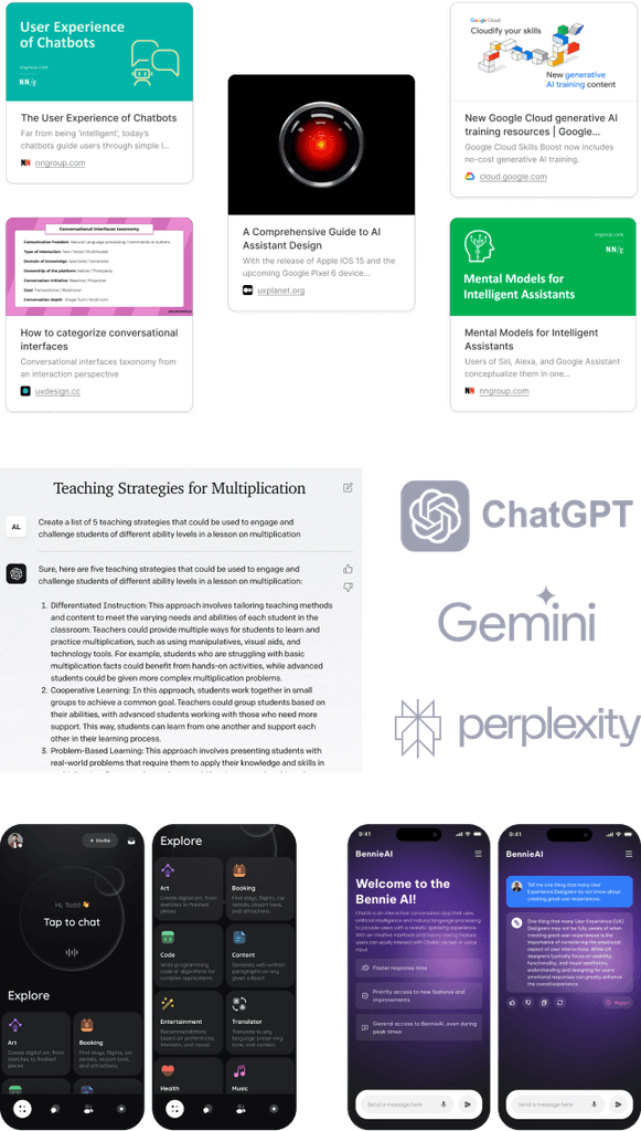
Highlights from our research journey

Imagery highlighting different research sources
Strategic Insight

We prioritized a simple, scalable interface that required minimal training and focused on a familiar user experience. This approach ensured quick adoption while future-proofing the system for growth.

Early design explorations

Imagery showcasing early design iterations
Imaery showcasing early design iterations

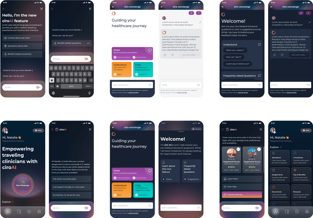
Concept refinement

Imagery highlighting design refinement towards final solution
Our Solution

Intuitive Access: Prioritized easy access with a prominently placed tray button that opens a drawer, allowing users to engage with the chat without disrupting their current experience.

Streamlined Experience: Designed an overly simplified interface tailored for non-tech-savvy users, ensuring accessibility and ease of use.

User-Friendly Interface: Implemented an easy-to-use chat interface with a simplified UI, facilitating a smooth transition into the new space.

Future-Proof Design: Laid the groundwork for future iterations and functionality updates, ensuring scalability and ongoing user engagement.

App screen showing tips for how to interact with an AI chat
App screen showing an inut field populated with user prompted text
App screen showing a user conversing with an AI chat

Outcomes

A key metric was reducing recruiter back-and-forth. In just one month, our initial iteration saved recruiters 80 hours, enabling them to focus on more pressing tasks and making information more accessible to clinicians.

Impact

Clinicians noted that the simplified design not only improved efficiency but increased user confidence in adopting AI solutions. 

My Key Learnings

AI is an exciting challenge and offers a wealth of new UX possibilities.

Sometimes it’s better to over simplify and let your users gain familiarity before offering more functionality.

AI should be leaned on to enhance the user experience, not over-shadow it.

The journey continues,
check out what's next!

© 2024 Brian M. Peters

© 2024 Brian M. Peters

© 2024 Brian M. Peters